How Do I Make My MerchantCircle Listing Look Better?
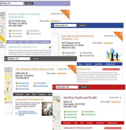
It's nice for MerchantCircle to have been featured on many sites that recommend the best places to list your business on the web, including here on Entrepreneur and Search Engine Land, amongst others. We now have merchants in every state and nearly every county in the Unites States. For the 640,000 business owners who have already joined MerchantCircle and future members, it's important that you utilize your listing to the fullest of it's abilities. Besides writing a blog, which you should definitely do consistently, you can dress up your listing as well and make it stand out more. Here's a look below at just some of the color options, which you can find by clicking here on your Merchant Dashboard:
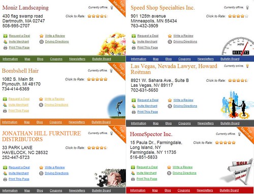
 You also have the option of placing icons on your listing that are relevant to your business. This will help make your listing more visually appealing and personalized. Below are just a few of the options you can choose from. Clicking here will take you to your there.
 Take a moment to dress up your page. It's all free, fun, and can quite possibly catch the attention of a customer's eye.
Sincerely,
Kevin
Community Relations
Labels: Merchant Circle, MerchantCircle, MerchantCircle.com


1 Comments:
This is great help. Thanks!
Mary-Anne
sumthng4all
merchant circle
Post a Comment
<< Home